Miter: Brand, Look & Feel
- ← Projects
- Date:2020 - 2022
- Role:CEO, Founder, CPO, Designer
Background
Creating a visual identity can be a months-long, million-dollar endeavor, or...not. As a pre-pre-seed startup with two founders responsible for everything, our only option was the latter. But we like to be scrappy and pragmatic! Indeed, our no-nonsense, efficient approach to branding and marketing design emerged as a strength for us.
Every design project needs constraints: nothing is harder than, "Just be creative!" We started with an exercise I learned from Focus Lab to generate three adjectives describing our brand as a whole—visual and otherwise—and arrived at generous, irreverent, and wise.
Logo

For the logo, I explored shapes rooted in the concepts of joining and collaboration, since those were central to our product vision and the name "Miter" is derived from a type of carpentry join.
Brand Choices
Colors: I was inspired by Tiffany blue. Blue, in general, is often associated with established, trustworthy organizations; like Tiffany's, ours injects a note of green to move it a little outside the ordinary and make it more personal. The magenta-ish secondary color emerged from exploration in a color-scheme generator. I'm always nervous about shades of red because they're needed for error messages, but this didn't cause us too much trouble. I like its boldness.
Fonts: I paired strong, friendly serif font (Servus Slab) with a modern, approachable, classic sans (Trade Gothic Next.) These choices reflect a philosophy I bring to any project: there's always room to distinguish oneself, to do something unique. That means staying away from free Google Fonts and using less-traveled ones; and for a budget-constrained startup, Adobe Fonts is a happy medium.
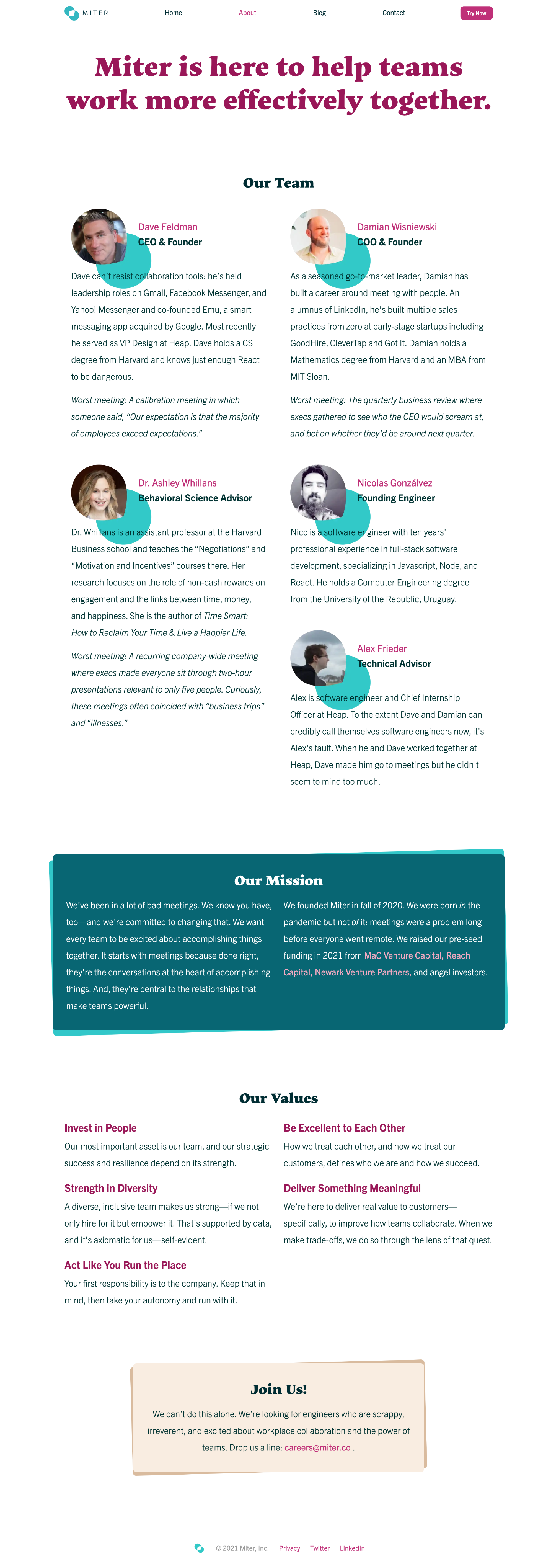
Shapes: Digital design is all about rectangles, and I often look for a way to break out of that mold. Here, that's expressed via containers made up of two angled boxes, and by carrying the angled logo through into our team avatars.
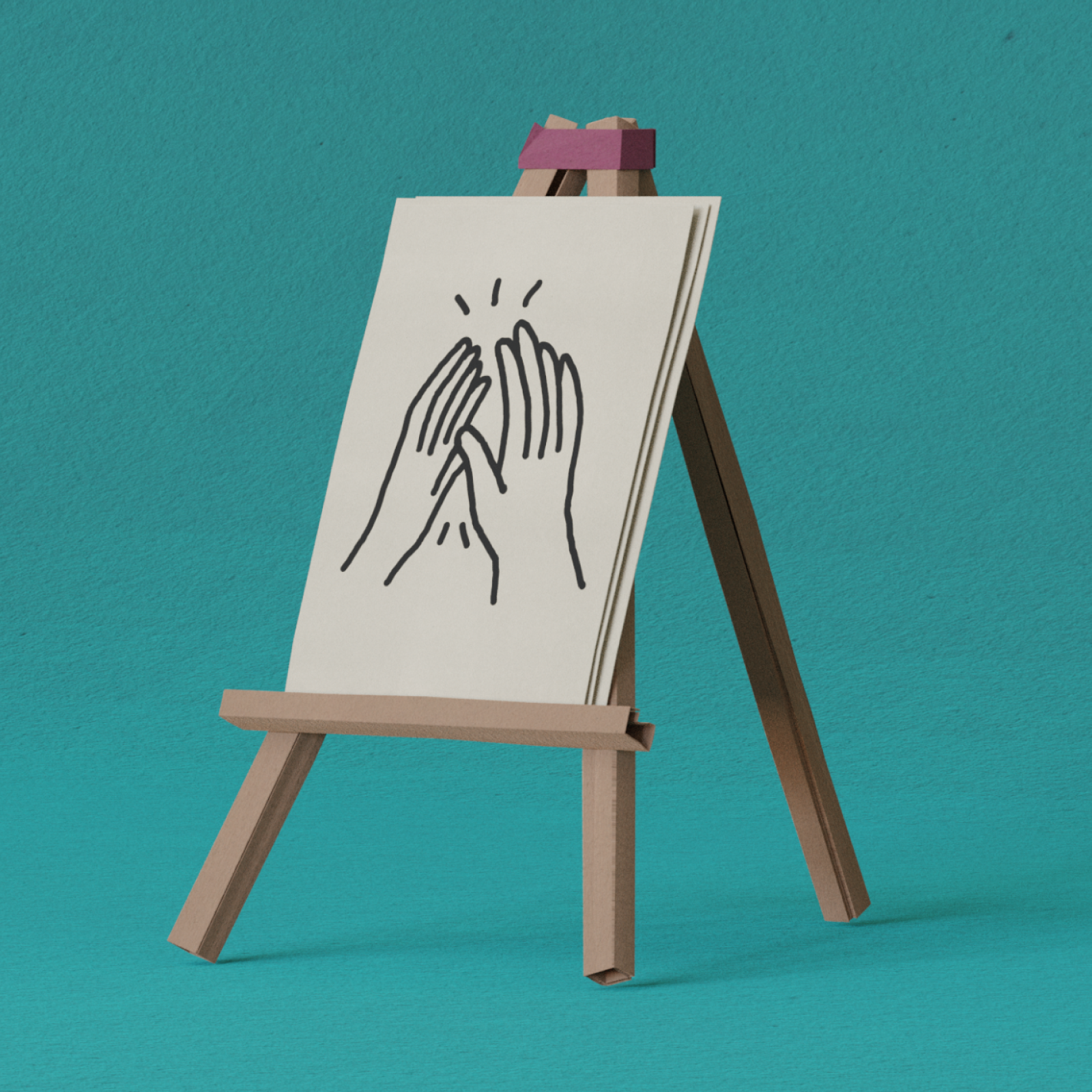
Images: Early on, I experimented with 3D renderings using a construction-paper style, but ultimately I reverted to a flatter look, both due to the effort required and because the 3D felt a little out-of-place.


Look & Feel
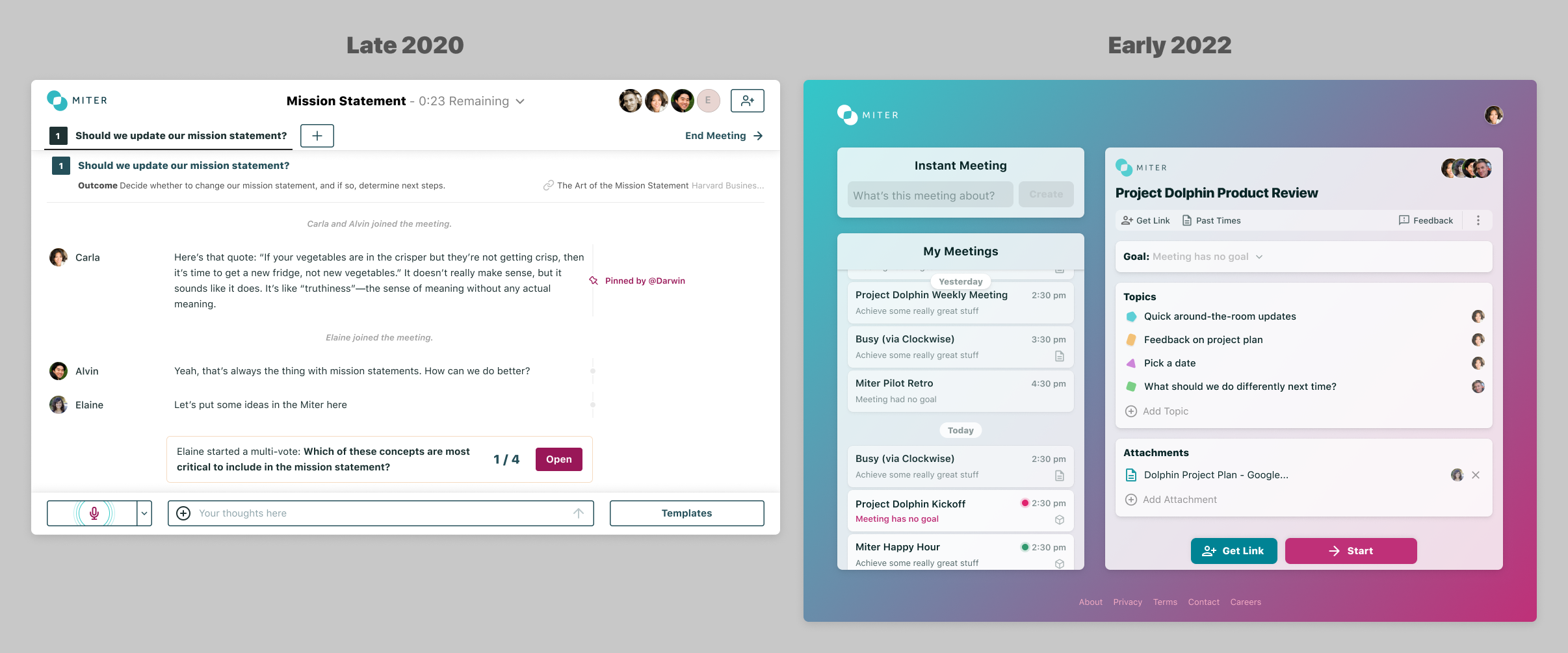
As with the brand, I wanted to create something unique for our look & feel. My early prototypes used a style I called "tax form chic," and I'm still a fan of it. But as the functionality and sidebar form-factor of our v1 product took shape, that look didn't quite fit--and would have required more work. Front-end component libraries implement a relatively narrow band of accepted styles, and the further one ventures from those, the more work one takes on.
So, using Dribbble for a baseline understanding of current trends, I came up with something a little more mainstream, though still unique, and rooted in our brand.

I'm happy with the result, but as the product complexity grew in 2022 it was starting to outgrow the look & feel. Techniques like shadowed cards and big, friendly fonts work well information density was low but create chaos as density needs increase. I'd already started to make changes—decreasing font sizes, toning down colors, and so forth—and, in the background, was exploring broader changes.
Such changes can be a lot of work. But knowing change is inevitable, especially in the early
stages of a product, we kept our styles as centralized as possible in the codebase via CSS structure and the use of
LESS. (Indeed, our main style guide was simply the Global.less file in our client code (used by our website, too).
Reflection
-
Visual and brand work can take as much or as little time as you want, with varying results. I'm happy with the balance we struck and the techniques we employed to be principled and directed while moving fast.
-
That's true with our technical choices, too: centralizing styles up front in the app, moving from Webflow to Gatsby to enable not only better performance but faster iteration and experimentation.
-
Communication is a huge component of any designer's job. My co-founder hadn't worked directly and extensively with a marketing designer before, which meant thinking about how to structure the conversation and convey design thinking—and also remembering that some "designer-speak" does more to obscure than to illuminate.