Pulsra
- ← Projects
- Date:2017
- Role:Product Design Consultant
Background
Pulsra was a Seed-stage startup founded by ex-Facebook leadership. Their mission: help people make better use of their work time by providing a better calendar, and a way to work with calendars across organizations.
At the time, they had ~12 employees and no designers. They'd done some prior work with an agency but needed to take things further. I stepped in half-time and helped with usability, visual design, and by tackling some of the tough UX challenges they'd taken on. I also advised on overall product & design strategy, and helped them hire their full-time design lead.
Mobile App
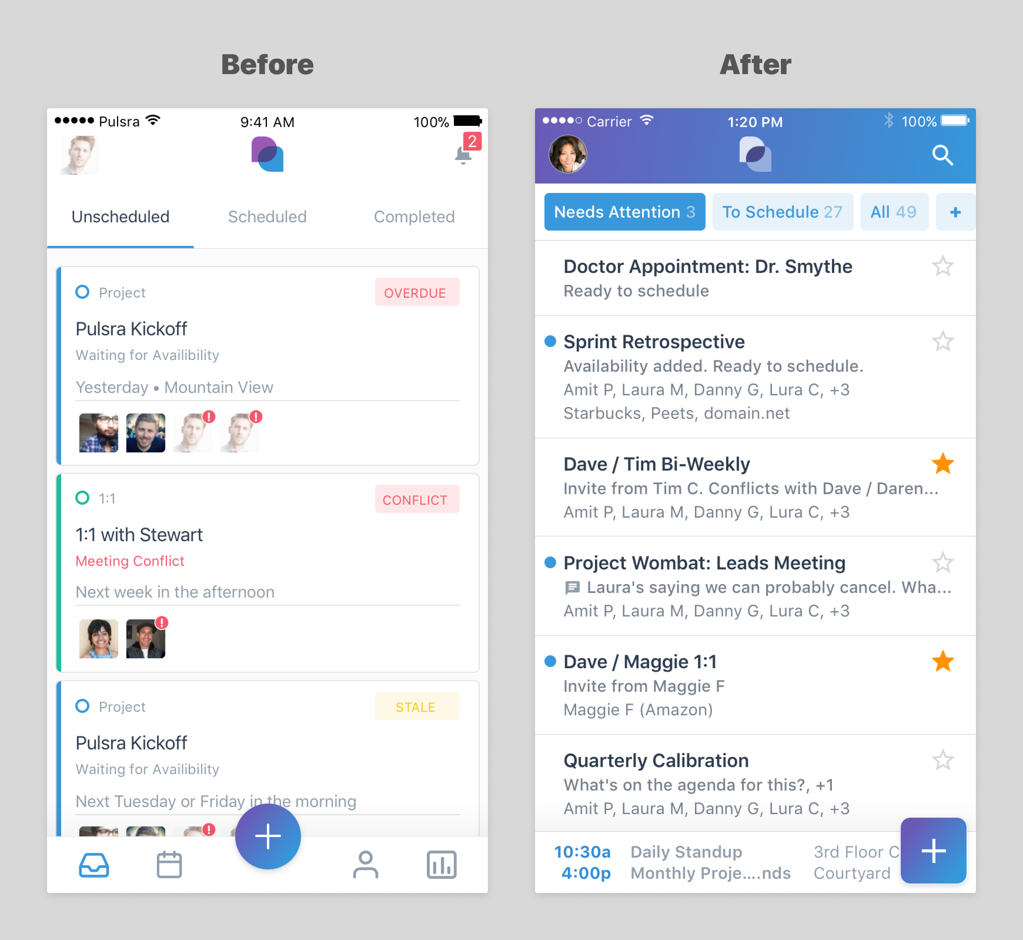
Starting with the existing agency-provided designs, I clarified and prioritized use cases; analyzed flows and streamlined them; evolved the visual hierarchy and increased information density; simplified navigation; and brought the experience more in line with current mobile platform standards.

Desktop Web
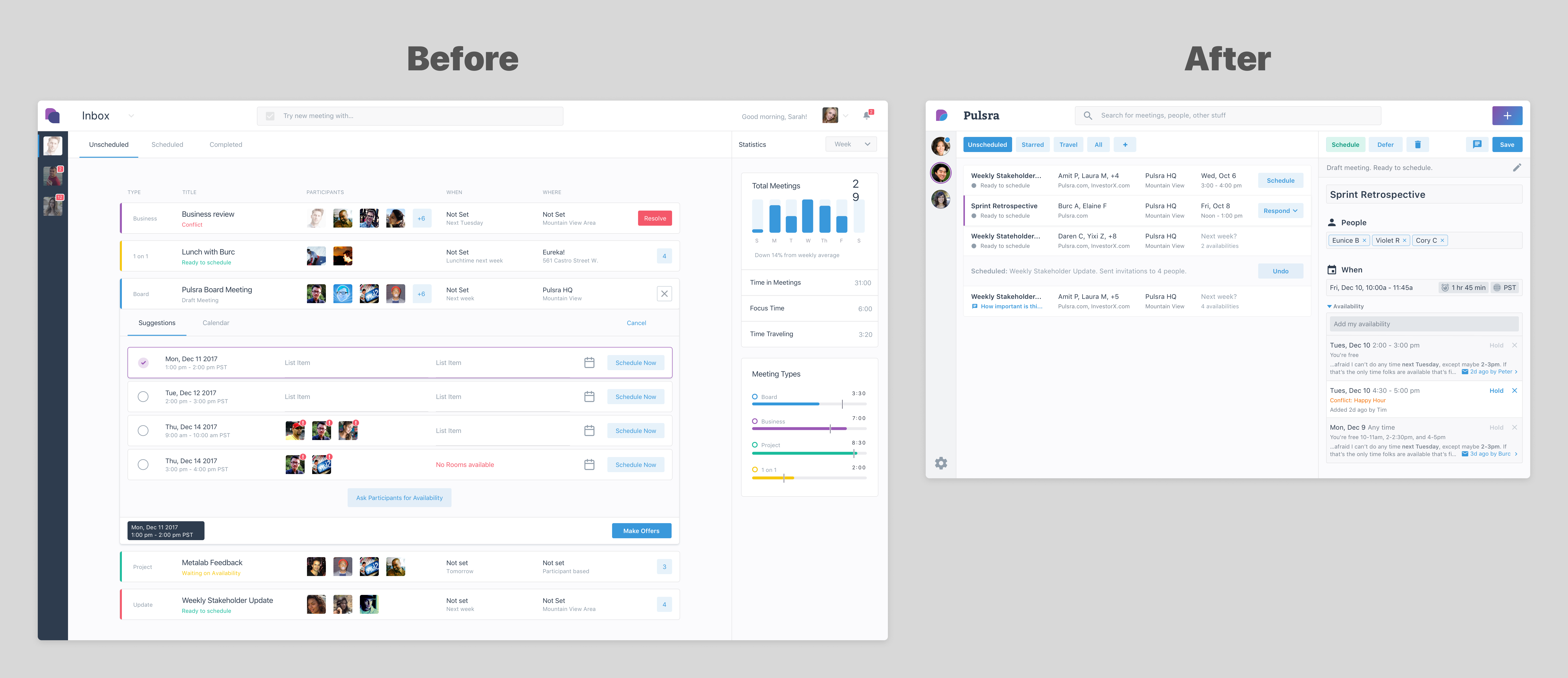
My work on the desktop web app paralleled that on mobile. Here, I moved the look & feel in more of a desktop-app-like direction—increasing the difference between mobile and desktop experiences to reflect their respective platforms, while retaining an overall coherence across them.
Note also my shift from 1800px-wide mockups to 1280px, focusing the design on a more common window size.

Foundational Explorations
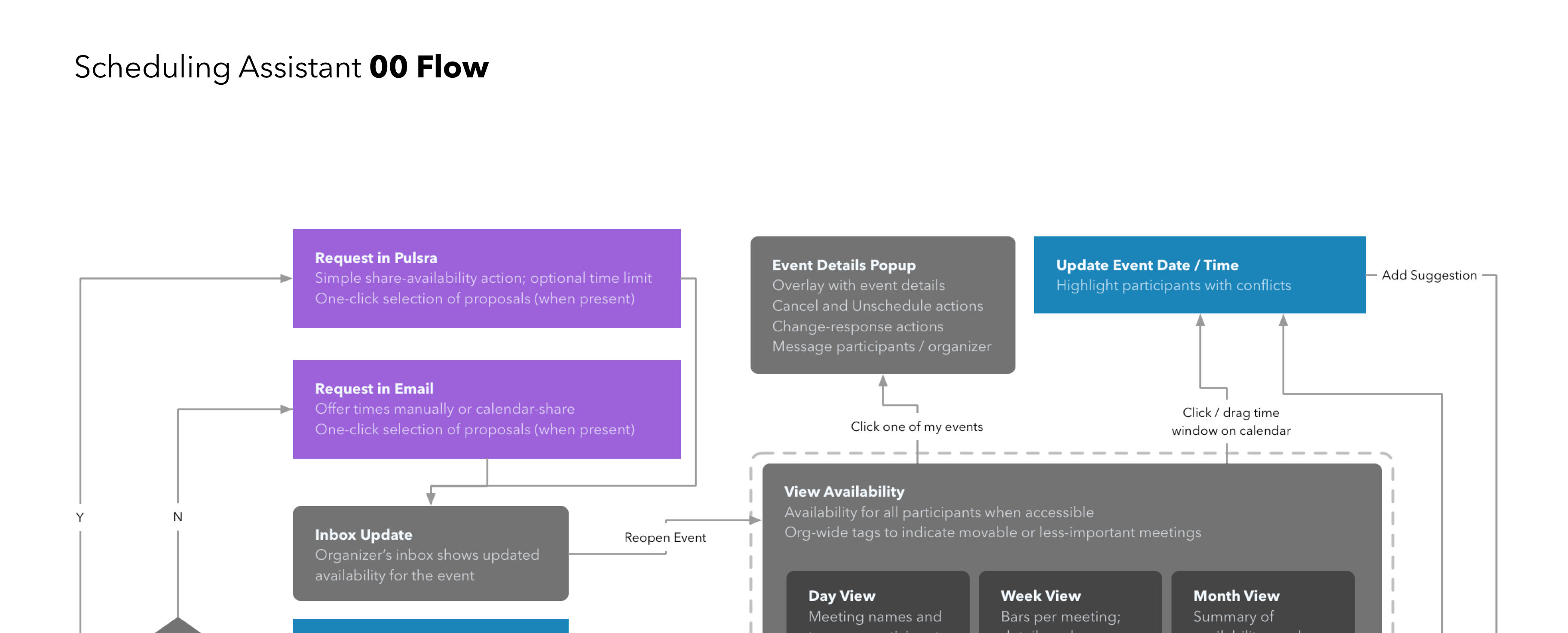
Scheduling groups of people across calendar systems may be one of the great unsolved problems of enterprise productivity.
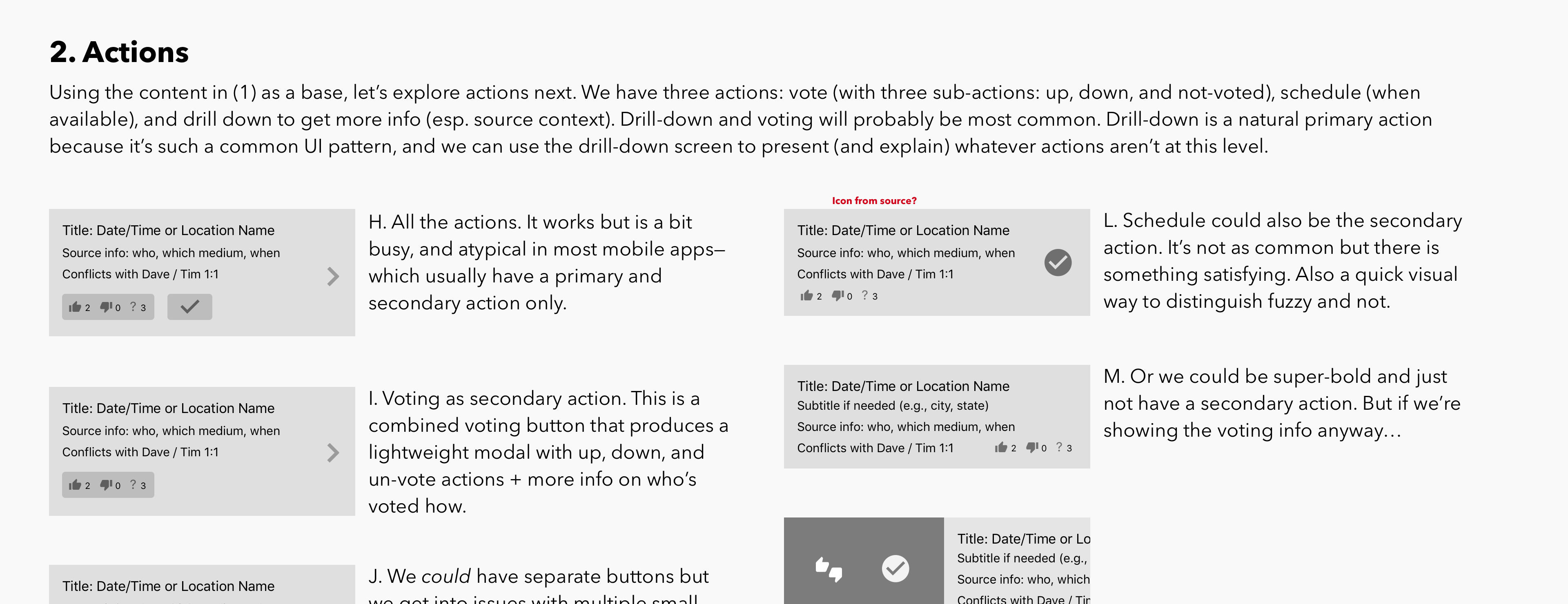
In the context of this project it was no less challenging, and I made use of numerous types of artifact in the course of tackling and discussing it.
Ultimately, our approach was ambitious and promising, but the overall problem remains unsolved—with Calendly offering the closest solution I'm aware of today.


